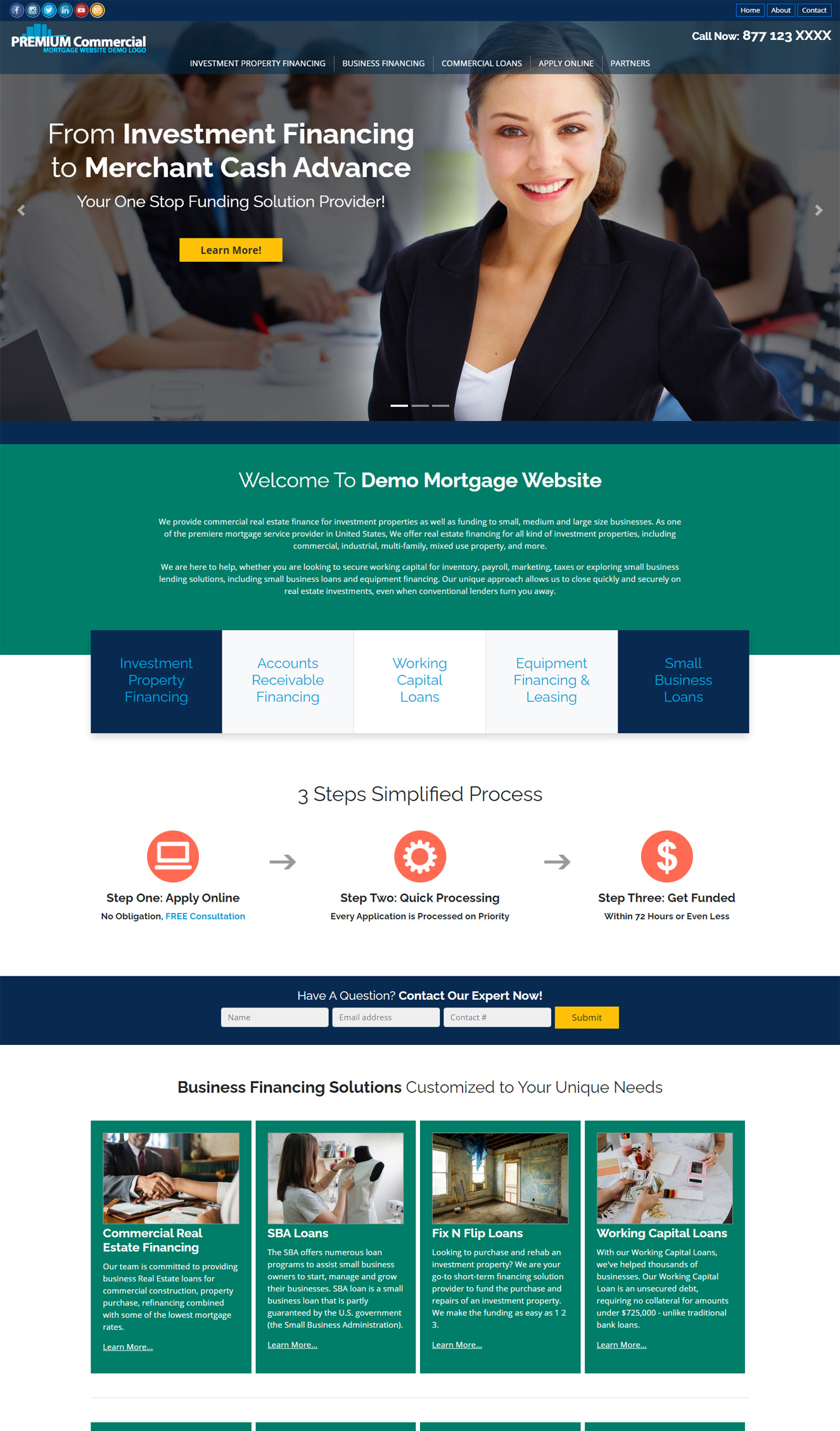
These days, loan shoppers expect the best user experience based on the latest mortgage website design trends. They expect to navigate through your offers with ease. Making their experience as seamless as possible is extremely important. Because online visitors these days like to shop sitting comfortably in the luxury of their homes.
A website with a great online experience will make all the difference between converting visitors into mortgage leads or losing potential clients.

A high performing website can attract and keep visitors glued on its content. It facilitates interaction between mortgage professionals and potential clients. It can also generates leads on autopilot. Adopting the following top trends can build an authoritative online presence. For more information, get in touch with our team of professional designers at iReadySites.com.
Top 10 Mortgage Website Design Trends in 2024
1) Videos
“One-third of online activity is spent watching video.” (WordStream)
Online users have a very short attention span. They are more likely to engage with videos rather than static lines and lines of text. Videos allow them to consume more content in a short period of time. Look at YouTube stats, the second largest search engine in the world:
- 2.49 billion active users each month.
- Over 500 million hours are watched on YouTube every day.
- YouTube now has 100 million paying subscribers
- People watch almost an hour YouTube videos each day
So it’s worth adding some videos on your website. Whether they are explanatory videos or a full-screen video background on your mortgage website.
2) Unlimited Scrolling
Unlimited scrolling is not a new feature. But yet a very few websites in mortgage industry take advantage of this great tool. Adding unlimited scrolling feature on your mortgage website helps visitors to browse information quickly. The don’t have to click constantly on links to access different pages.
3) Mobile Friendly Mortgage Website Design
On top of that Google’s ranking algorithm considers user experience an essential feature while ranking websites. A mobile-friendly site enhances user experience and hence helps in ranking higher on search results.
4) Readable Typography
Properly utilized typography plays a vital role in engaging your online visitors. It is one of the core principles of a great mortgage website design. That is why, use of latest clearly readable fonts on a mortgage website shows professionalism. It also ensures ultimate clarity and readability of critical details. This involves font style, presentation, and structure, which aims to convey specific messages in the most effective manner.
5) Convert Your Mortgage Website Into a Mobile App
Mobile apps have 100% to 300% higher conversion rates. They are lightening fast when compared with traditional websites. Users can have access to the desired loan product information even when they are offline. Also, apps can seamlessly identify the live user location. Using this extremely valuable information, you can send custom made push notifications that will help you generate more leads.
6) You May Not Need a Custom Coded Website
One of the most important thing to remember. A website is not a one-off project, it’s an on-going process. Most business owners think that they would pay a one time fee of $5k to $50k for a website design and development and that would be it. But unfortunately this is far from the truth. Within a couple of weeks of finalizing your new website. A new hosting update will come and you’ll end up paying $$$ of dollars again to update the website codes.
A “good” mortgage website is a tool that helps you grow your business. Little changes like a new headline, contact details update must not costs you an arm and leg. Additional expenses won’t help you much in growing your mortgage business.
So you should be able to update your website yourself by using some kind of content management system (CMS). Our pre-designed websites provide all these features. Instead of paying hefty one time fee to a designer. You should rather pay a monthly flat-rate and improve the website over time.
7) Eco-Friendly Website Design
Sustainable design focuses on less negative impact on the environment, health and well-being of the people live in this world. With the rise in eco-friendly initiatives across different industries, web design experts are taking note too. They are implementing sustainable mortgage website design practices. Notable among them are code optimization for faster loading times, server-side optimization, client-side efficient caching and use of content delivery networks (CDNs) to minimize data transfer.
8) Color Trends
Every year, a new color becomes the norm for the web. In 2024, color experts are betting on rich, balanced colors to step into the forefront with soft pinks, soothing blues, and deep nature tones.
PANTONE 13-1023 Peach Fuzz became the Pantone Color of the Year 2024 (Pantone)
9) Blending Photos with Graphical Elements
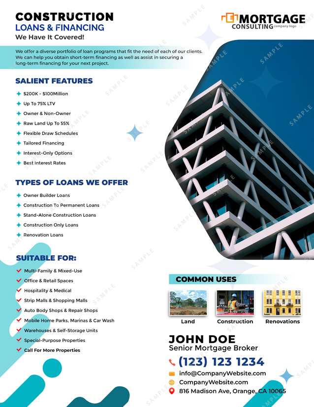
Mostly on social media or mortgage flyer design, you see this mixing technique where graphical elements such as circles, stars, triangles, etc are blended with regular images.

The technique is also getting popular on websites too. Mixing images with graphics can reinforce your company branding and keep website visitors engaged with your content.
10) Progressive Lead Generating Forms
For most website the primary purpose of their existence is to generate leads. Forms are the way to complete this goal. However, we don’t want to spoke our potential clients by asking too many questions at any particular time. Progressive/dynamic forms solve this dilemma. These forms might just ask for the name and email address at the first stage. And then ask for a contact number, property information, and details about borrowers’ income at the next conversion opportunity.
Conclusion
Mortgage website design is an on-going process. A website needs to be updated regularly with fresh genuine content. And it should follow the latest trends in design and development. Videos are many-fold better than static content. It’s much better to go for a pre-designed mortgage website design rather than a custom coded solution. Because it can save you lot of time, efforts and cost. You can just pay a small amount monthly and gradually improve your website.

Leave a Reply