This post assumes you know what is a landing page? If you are not sure, please visit What is a Landing Page?.
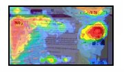
Lets start with the heat map:

I am not going to get in detail about what a webpage heatmap is, but for the time being, the red and the areas around red are more significant. These are the areas where a visitor pays more attentions, so our core stuff related to the action should be within these areas. Following tips will assist you in understanding how to use visitor heatmap to create the immaculate lead capture landing page.
- The Ad and your landing page should be relevant:
Whatever you are offering in the ad, your landing page should clearly and boldly present that. Remember they only came to this page, because you promised something on your ad, which is relevant to what they actually looking for. And they expect that your landing page, would have more of it. Make sure your headline refers directly to the ad copy that drove the click. - Provide a clear call to action:
This is the most important part, tell your online visitor what they need to do. There is no set role for how many Call to Action buttons (or text) you use on a single page. 2 are good for a short landing page and 4-5 in a long landing page. - Focus on getting your visitors to do 1 thing:
Don’t confuse your visitor, don’t suggest many types of actions, focus on one and only one thing. Write whatever you like, but to the point. The key is to take your visitor to a point, where they know, what they need to do. Don’t make them guess or hunt around! - Start and end of the Page is the key: Most of the visitors would be reading the top and than scrolling down to the bottom to get a glimpse of what this is all about. Therefore the most important points should be at top and at the end.

Leave a Reply