When choosing for the perfect website design, your primary goal is represent your mortgage brokerage in a professional manner. Your website serves as the entry point to your business. It can make or break your online presence. So what makes a great website? Here are the 10 essential features, every website must have.
1) Visually Appealing Website Design
A great looking website will make an exceptional first impression, boost credibility, engage visitors, and a lot more. Your online visitors will often judge your company by the appearance of your website. If it doesn’t look good on a screen, have old outdates design, it will create a bad impression.
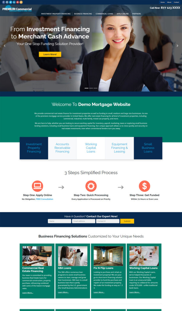
And it’s not that difficult to create an awesome looking website. Just use high-quality images, stick by some awesome color scheme, use readable fonts, and present content in a symmetrical manner. Here is an example of a stunning mortgage web design:

2) What Makes a Website Likeable To You?
All the answers to a perfect website design lies under this question. You are a consumer and online visitor too, so look at your favorite websites. What makes them good? Just do a through research and then implement the findings on your own website.
3) Responsive Website Design
With everyone with a hand-held device, it’s essential to have responsive website. You need to make sure that your website is mobile friendly and compatible across all devices. Google had a Mobile-Friendly Test tool and the Mobile-Friendly Test API for this. But they are retired now, on December 04, 2023 google posted this on X.
“Today we’re sunsetting Search Console’s Mobile Usability report, Mobile-Friendly Test tool and Mobile-Friendly Test API. We believe these tools helped website owners make the web a better place – thank you for working with us on this journey!“
For the same reason, now Google Lighthouse is used to analyze website’s overall quality and user experience of web pages.
4) Navigation
Website navigation is an essential part of web design because it helps provide an improved user experience. A good navigation is equivalent of “an apply a day keeps the doctor away’. A well thought navigational structure will make sure that user stays longer on your website. Which will eventual reduce the bounce rate. Google likes websites where users spend time, and will list them higher on the search results. Furthermore, this will bring more traffic and higher likelihood of leads and sales.
5) User Friendly Website Design
Website must be easy to use to provide a good user experience. A user-friendly website can provide a wide range of benefits, including:
- enhanced user experience
- increased engagement
- better conversion rates
- improved SEO
- better brand perception and credibility
- higher ranking by search engines
6) Content Management System
This doesn’t fall directly under the web design, but a content management system definitely help in maintaining a website. A content management system (CMS) helps business owners keep their website updated. They can create, update, optimize, and deliver content to the target audience at the right time.
7) Social Media Proof
A social proof or social media proof is when your current users recommend your product and services. This primarily comes in the forms of user reviews on popular websites such as Google, Yelp, Facebook, Twitter and more. In addition, testimonials and endorsements from influencers count as social proof too.
8) Keep It Consistence
Consistency in web design is key to a quality experience. It helps user navigate through your website quickly and efficiently. Consistency means keeping the overall look and fool of the website intact across all the pages. In conclusion, consistent site elements such as header, footer, navigation bars, color scheme, and typography can make the site easy to navigate.
9) Lead Capture Forms
Unquestionably Lead capture forms are single most important thing on a website. Besides, they’re an excellent way to generate high-quality leads and increase conversion rates. On these forms you can collect contact details of potential customers and use it to contact them in the future to offer details about loans you offer and invite them to make signup with your company.
10) Keep It Simple
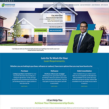
A good design doesn’t mean you need to overdo things. A simple design can accomplish your goals too. Simplicity is your best friend when it comes to website usability. Stick to four to five colors, use one of two fonts/typfaces, and don’t overuse graphics. For instance, here is a great example of simple website design:

So how do you get such a web design?
Here are some options:
- Hire a website designing firm
- signup for some online mortgage website builder and build your website using the online editor and available tools.
- Purchase a mortgage website template
- Or go for a semi custom solution. Where you can choose a template and then modify or get it modified from the provider.
All the above options are great. But what suits you best depends on your specific needs, budget, time and the skills you have. If you have enough time and ample funds, a website designer or web design company would be a great option. You’ve limited budget and enough time on your hands, option two is your best bet then. Third option is works best when you have less time and very limited amount of money to spend on your website.
iReadySites is providing website design services since 2009
Option four is what iReadySites offers, it offers affordable, quick and professional design services. Everything you need is available under one roof. We know what makes a good design and doing this since 2009.
iReadySites offer pre-designed and custom mortgage websites. We make sure that you get the web design solution that actually works for you.
Contact us today to get started with your new mortgage website today!

Leave a Reply